Highest Arctic Sea Ice Extent on 02/02, Since 2009

February 4, 2020

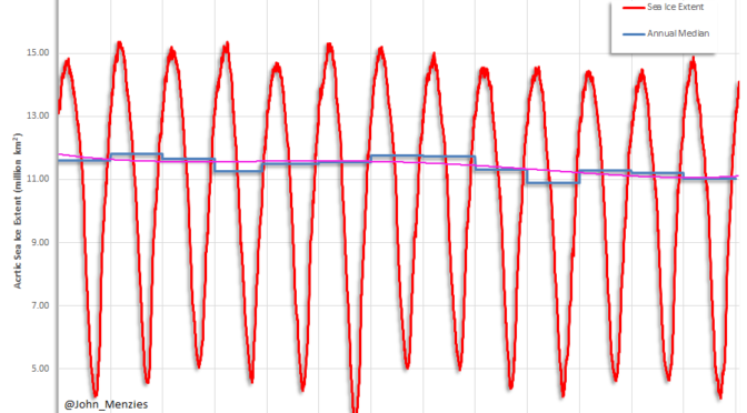
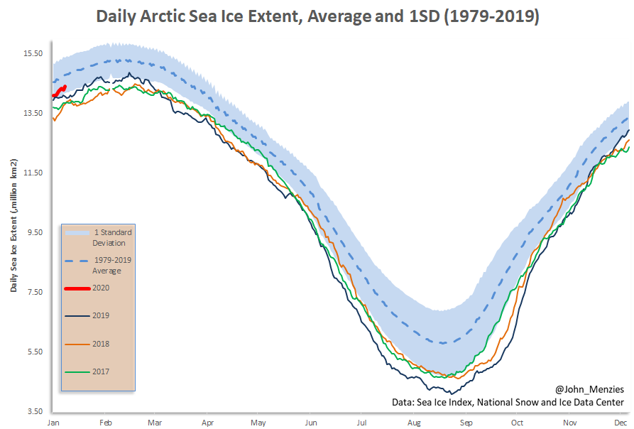
The Arctic sea ice extent is within 1 SD of the 1979-2019 mean and the highest since 2009 on this day. It is no surprise that this remains unreported in media. A plot of the sea extent time series from 2007 to 2020 shows no significant trend and lacks any evidence for a crisis in the Arctic.

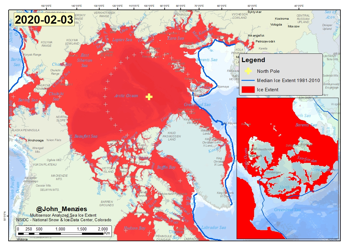
Mapped Arctic sea ice extent (SIE) on 02/02/2020 was 14.42 million km2 which is 370,000 km2 or 2.5% less than the 1979-2019 average.  This is largest sea ice extent on this day since 2009 and is within 1 SD of the 1979-2019 mean ice extent.

The average sea ice accumulation rate in the last 5 days is 55,000 km2/day. The 2019-2020 winter rate of sea ice accumulation is amongst the highest on record and sea ice extent, volume and thickness are not expected to peak until March, 2020.

A close up of a map

Description automatically generated
MASIE Arctic Sea Ice Extent and SIE Median for the period 1981-2010

Arctic Sea Ice Extent (MASIE Database – see above image) for the month of February for the period 1979-2020 with the 1979-2019 average.

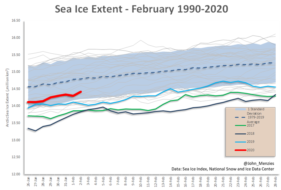
The daily sea ice extent data for February for the period of available data from 1979 to 2020 is shown above. The current sea ice extent is well within the 1 SD of the 1979-2019 average and is the highest since 2009. Arctic sea ice extent shows little trend since 2010.

Arctic sea ice extent is not expected to peak until March 2020.

Annual Arctic sea ice extent 2017-2020 and average and +/- 1SD for the 1917 to 2019

What can be concluded is that the Arctic is not disappearing and that there is little evidence to support the endless claims over the decades that the Arctic sea ice will vanish during a coming summer. While CO2 has increased during this period sea ice extent has failed to decline as predicted. Where is the crisis in the Arctic as there seems to be no relationship between atmospheric CO2 and Arctic ice extent, volume or thickness (see earlier posts)?

The extent of Arctic sea ice varies from summer to winter. The sea ice extent shown here relies on data from the Multisensor Snow and Ice Mapping System (IMS) that runs at the National Ice Centre. The IMS product uses several satellite data sources including passive microwave, but it is also based on visual analysis and other data sources and undergoes a form of manual data fusion. The data reported here has a 1 km resolution and was sourced from the National Snow and Ice Data Centre

1984 the Maldives is Disappearing

Over the last 20 years at least there have been near continuous press reports of the near-term disappearance of the Maldives, a series of coral atolls in the Indian Ocean. The chain of 26 atolls stretches from Ihavandhippolhu Atoll in the north to Addu Atoll in the south with an aggregate landmass of about 298 square kilometres (115 sq mi). It is one of the world’s most geographically dispersed sovereign states as well as the smallest Asian country by land area and population, with around 520,000 inhabitants. Malé is the capital and the most populated city, traditionally called the “King’s Island” for its central location.

The alarmist media claims that human induced global warming, resulting from carbon dioxide emissions is to blame for the imminent inundation.

If there is a crisis in the Maldives with the 500,000 about to soon become climate refugees, then it should be evident in the Google Earth imagery. We have compiled the satellite imagery for the Kin Island for every year from 1984 to 2016. You can determine if the Maldives is disappearing.

It can readily be seen in the tide gauge data for Mumbai in India and Fremantle in Western Australia that Indian Ocean sea levels have been rising steadily since record keeping began in the 1800s. There is no evidence in this data (the longest records in the Indian Ocean) that sea levels of recent times are rising catastrophically or have any relationship with atmospheric carbon dioxide concentrations.

Tide Gauge data from the port of Mumbai in India. (Data: NOAA, Center for Operational Oceanographic Products and Service)
Tide Gauge data from the port of Fremantle in Western Australia. (Data: NOAA, Center for Operational Oceanographic Products and Service)

There is a risk of inundation in the Maldives however it is due to the natural rise of sea level and has nothing to do with human activity and no amount of expenditure will halt this rise in sea level.  The Maldives should build to accommodate future sea level rise, rather than blame carbon dioxide emissions and seek rent from western countries.

Media reports would indicate that investors remain keen to invest with numerous new airports and resorts under construction.

Novel Corona Virus Progression, Reported Rate of Transmission is Slowing in China

Novel Corona Virus Progression, Some Observations

Coronaviruses take their name from their crown-like halo.Credit: EYE OF SCIENCE/SPL

We started to track the Novel Corona Virus (nCOV2019) back in mid-January and based on the reported statistics developed a model for disease transmission and mortality. The training period for the model is shown in blue below and the underlying parameters have not been changed. Assumptions included a reduction in transmission rates as a consequence of public health measures in the near term plus a reduction in mortality rates as treatment methodologies improved and ultimately the recognition that some of the more exotic anti-virals had some impact. At the time we considered the model to be optimistic.

nCOV2019 reported cases by Chinese province. Data: John Hopkins

The disease progression for the reported data for all the Chinese provinces is shown in the graphic above. What is obvious is the similar slope to all the case trends (at the same axis scale, Hubei has the same slope as other province). The straight line trends on the log scale simply reflects the logarithmic nature of disease progression for a disease with Ro>1. The chaotic trends at the beginning of the record likely reflects delayed reporting. While there has been some comment that epidemiological models predict, based on an Ro of 2.2, 10 times the number of cases, the Chinese reported data would appear to be internally consistent and we are inclined to believe the data, until proven otherwise.

nCOV2019 reported cases and deaths (Data: John Hopkins) and model progression.

Comparison of the reported cases and deaths to the model is revealing. While the mortality rate shows very modest decline the rate of transmission appears to be declining significantly likely in response to the remarkable Chinese public health measures. Progression of the disease in countries outside of China is as would be anticipated. It is surprising that there are no reported cases in Africa. Considering the state of African medical services if nCOV2019 were to become established, the impacts on the continent could be more significant than in China and elsewhere in terms of totals cases and mortality.

The nCOV2019 outbreak is far from over but there are some positive developments in China as is evident in the data. We should not underestimate, that while the disease likely originated from the consumption of bats, the Chinese public and medical profession have behaved heroically.

China will now likely reflect on its public health investment and importantly on the interaction between the public and wild animals. The risk of new novel viruses will not be reduced until the consumption of exotic animals, particulalry wild mammals, is better controlled.

Heatwave, snow records being broken in Australia! The data record begs to differ.

With the usual breathless hysteria that has become the mainstay of journalism, the above article goes on to claim that temperatures will plummet to 16C after Hobart saw a record 40.9C – “its hottest day ever”. More of the usual journalistic alarmism playing to the narrative that 21st century temperatures are the highest on record.

The meteorological station in Hobart is located in a built-up area on Ellerslie road and has a nearly continuous temperature record dating from 1882.

Ellerslie Road highest and lowest monthly temperatures (Data: Bureau of Meteorology data for station, 94029)

The graph of the maximum and minimum temperatures for Ellerslie Road shows that 2013 was in fact the highest temperature in the record with a warm 41.8C, but temperatures were comparable in the late 1800s as can be seen. While the maximum temperature is expected to see 16C, this is nothing unusual.

On 30th December 1897 the thermometer recorded 40.6C but fell to 17.4C two days later and was 14.6C a few days before on the 20th December 1897. This is the period of the worst drought in Australia, the Centennial Drought and this high temperature was followed by another record on 1st January 1900 with a peak of 40.6C when only days before, on the 27th December 1899, the maximum was a mere 14.6C.

In Tasmania these temperature fluctuations are nothing uncommon.

Mount Wellington covered in snow after 40C day. (Supplied/Adrian Van Beek)

More interestingly there is a long-term upward trend in both the maximum and minimum temperature data for Ellerslie Road, which is evident in the Mean Maximum Temperature Anomaly map (using a mean of 1882-2020). However, the overall temperature trend seen in other Australian data of high temperatures around 1900 and comparable temperatures today is evident in the data.

Ellerslie Road mean maximum temperature anomaly (Data: Bureau of Meteorology data for station, 94029)

While this might reflect a long-term temperature change for the Hobart region it might also be related to the location of the meteorological station which is now surrounded by roads, houses, car-parks and multistorey buildings.

A picture containing circuit

Description automatically generated
Ellerslie meteorological station location in a heavily built-up region of central Hobart, Tasmania.